Fonts and Logos: Difference between revisions
Gyakusetsu (talk | contribs) |
No edit summary |
||
| Line 183: | Line 183: | ||
''It is worth noting that fan Craig Brasco designed a logo for EvThreads that was in use until early May of 2007. The logo was reverted when management for the board changed.'' | ''It is worth noting that fan Craig Brasco designed a logo for EvThreads that was in use until early May of 2007. The logo was reverted when management for the board changed.'' | ||
[[Category:Evanescence]] | |||
Revision as of 18:41, 28 October 2007
This is a comprehensive list of fonts that Evanescence has used throughout their career. Some were original fonts that aren't publicly available, however there are always freeware equivalents or close facsimiles.
Fonts
Evanescence EP
Packard Antique Regular
Packard Antique Regular (by Typographer Mediengestaltung)
-This isn't the actual font, but it is the closest that can be easily found online.
![]()
Origin
Trebuchet MS
Trebuchet MS (by Microsoft Corp.)
-The font used for the album title, song titles, lyrics, and liner notes. Use spaces to get the same look as the on the album art.
![]()
Lilith
Lilith (by David Rakowski)
-This font was used in the liner notes for Amy's, Ben's and David's names next to their pictures. It appears to be the inspiration for the original Evanescence logo (just speculation, of course).
![]()
Fallen
Evanescent (Aeryn)
Evanescent (by Aeryn)
![]()
Evanescent (Gyakusetsu)
Evanescent (as tweaked by Gyakusetsu)
-The front cover logo and current band logo as well as the lyric song titles.
-Contains an added character (the extended 'A' from the new logo) and a few characters that have been re-spaced and re-worked a bit for accuracy plus the 'Fallen' logo (can be derived by typing out "±" (alt+0177).

Garamond
Garamond Premier Pro (Semibold) (adobe systems inc.)
-Used for the liner notes and back tracklisting. Also used on all Fallen era Singles and the Live CD/DVD set Anywhere But Home. A slightly stretched version was used for the Imaginary Radio Single.
![]()
Anywhere But Home
Anywhere (Gyakusetsu)
Anywhere (by Gyakusetsu)
-Used as the logo and tracklisting. (This font looks fine when small, but is rather jagged when enlarged; not recommended for use as a normal typeface.)

Anywhere (Brittany)
Anywhere But Home (by Brittany)
-Same as previous font, a bit more correct when it comes to the alphabet (looks better when enlarged and when used as a normal typeface).
![]()
The Open Door Era
Hoefler Text (Bold)
The Last Font I'm Wasting On You (Mirror) (by Gyakusetsu)
-The official font used for the track listings on the back and lyrics pages of the album is called Hoefler Text (Bold). The REAL font is a hand-modified collection from the Storm Jannon font family that is not publicly available. The Last font I'm Wasting On You is a fan-made font that is fairly accurate, though not official by any means. The .ttf file also contains an accurate 'e' logo and "the Open door" cover logo.
See the example of the unofficial Call Me When You're Sober logo:

Versus the official Call Me When You're Sober logo:
![]()
Goudy Old Style
Goudy Old Style (Italic, Regular, Bold) (Microsoft corp.)
-Used for the lyrics, liner notes and acknowledgements sections of the album and any place else where there is text. Available with the Windows font package.

Curly Art Nouveau
Curly Art Nouveau (House of Lime)
-Used in the promotion of The Open Door. Contains the curly logo decorations and other fancy curvy characters including the one used in the EvThreads.com Version 1 logo and on Evanescence.com.

FrankRuehl
FrankRuehl (The Monotype Corporation)
-Also used in the promotion era of The Open Door. Used on the radio promo for Call Me When You're Sober and other various logos.
![]()
Logos throughout the years
Old Logo
The logo as can be seen on the Evanescence EP and on Origin. Very jagged and distressed. The only difference noted on Origin is that the logo was blurred slightly in places.

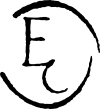
Old 'E' Logo
The logo used on the Evanescence EP on the disc and back insert. Also seen on the disc of Origin.

Daredevil Era Logo
The old Evanescence logo
-There is no font of the older Ev logo, however on Evanescence's old pre-Fallen website, there was a photoshop vector hosted that had the logo as seen on the Bring Me To Life Daredevil Radio Promo. It closely resembles the old logo, however it is far cleaner and sharper with straighter lines and more precise lettering.

The Evanescence Logo
-The logo we all know and love. Used on 'Fallen,' on all the promotional singles, and on promotional merchandise. Can be easily derived from the 'Evanescent' font by typing the characters "EVan+escéncç" (I know its weird, but you've gotta trust me that it works).

The Newer Logo
The Anywhere But Home and The Open Door era logo
-Has an altered 'A' character with an extended right leg. Used only on the Anywhere But Home cover, but when the The Open Door era came around, it began getting used everywhere from the album cover to t-shirts and stickers. Can easily be derived from the 'Evanescent' (as tweaked by Gyakusetsu) font by typing the characters "EVön+escéncç" (I know its weird, but you've gotta trust me that it works).

Japanese Logo
The logo designed for use on Japanese releases of Fallen and The Open Door. It phonetically spells the word as 'ebaanesensu' since there is no 'v' sound in the Japanese language.

Circular 'e' Logo
The simplest of design. This logo is the lowercase letter 'e' and, when turned 180o, looks exactly the same. Depending on whom you listen to, it was either a symbol originally drawn by Ben Moody or developed by a hired artist under the supervision of Ben and Amy. During the The Open Door era, the logo went through a bit of a makeover and is now skinnier. The 'Evanescent' font has the original logo (though it is somewhat distorted) as the '§' character, and 'The Last Font I'm Wasting On You' has the newer, slimmer logo (character '©')
| Plain 'e' Design File by Gyakusetsu. | |

|
This design alone was used on UK CD Singles and on Everybody's Fool Single discs. |
| Blurred 'e' Logo | |

|
The design found in the booklet of Fallen as well as T-Shirts from the Fallen era. |
| Blurred 'e' Logo, Variation | |

|
The design found on T-Shirts, buttons, stickers and various other promotional items from the Fallen era. |
| Thinner New 'e' Design. | |

|
The logo as it appears in The Open Door era. |
The Fallen Title Logo
Appears on the front cover of Fallen. This logo is very difficult to produce using the Evanescent (By Aeryan) font, so it has been included in the tweaked version. To get the logo, simply type out the character '±' (note: you must have the tweaked version installed to get this character)

My Immortal Logo
thanks to Gyakusetsu for drawing this file.
This design appeared during the era when My Immortal was released as a single. It is unknown if the symbol is meant to be something specific or not. You can find it on all International Single Releases (excluding those from the UK) and even appeared on a clothing item sold in the official merchandise store (now long sold out).

Anywhere But Home Logo
The logo found on the cover of all international releases of Anywhere But Home.
The Open Door Logos
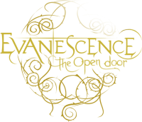
The Open Door Logo
Appears on the front of The Open Door and on much of the Merchandise sold surrounding this era. The logo is included in 'The Last Font I'm Wasting On You' and you can get it by typing out the character '®'. Contrary to popular belief, the logo cannot be derived by typing out "the open door" using the Anywhere But Home font. The two are indeed somewhat simmilar, though not at all a suitable match.

The Thorny Design
| Plain Thorny Logo Design File by orgo. | |
 File |
This design alone was used as a basis for all the rest of the designs. |
| Thorny Logo With 'e' File by orgo. | |
 File |
Design in the tray of The Open Door, on the Call Me When You're Sober Single and various other |
| 'Evanescence The Open Door' Logo Design Files by Padron_Rock. | |
 File |
The logo as it appears on the cover of The Open Door CD. |
| Variations | |
 File |
Faded version found on all American and European versions of the album. |
 File |
Same as previous; colored. |
 File |
Variation found on all Latin America releases of the album; colored. |
CD Art Design
Cd Art It's the art which appears on The Open Door Disc. Thanks to Gerard Armando

EvClub Logo
The EvClub logo as can be seen on EvFanClub.com. The fonts used are the standard Evanescent font and a variation on Kozuka Gothic Standard (L) (which is bundled with Adobe® Creative Suite 2 and not freeware) that has been skewed so that the characters are approximately 80% normal width.

EvThreads Logo
The EvThreads logos as can be seen on EvThreads.com. It is similar to that of the EvClub logo, utilizing the same typefaces. The fonts used are the standard Evanescent font and a variation on Kozuka Gothic Standard (L) (which is bundled with Adobe® Creative Suite 2 and not freeware) that has been skewed so that the characters are approximately 80% normal width. In addition, a character from the dingbat font "Curly Art Nouveau" (House of Lime) was used to create the decoration.

It is worth noting that fan Craig Brasco designed a logo for EvThreads that was in use until early May of 2007. The logo was reverted when management for the board changed.
